One of my dad’s favorite bits of fatherly advice was: Don’t bother doing something unless you’re going to do it right the first time. While it may not have been something I was particularly receptive to hearing at the time, it's a lesson I'm glad I learned in the end—and one that someone should have imparted to Nautilus as the company developed its new activity tracker, the Bowflex Boost[1] . While I would never describe the Boost as "bad" per se, my overall feelings about it can be summed up in one, memetastic expression[2] . Here’s why:
 My feelings about the Bowflex Boost, as illustrated by McKayla Maroney.
The hardware
The Bowflex Boost is a simple enough device: Wrist-worn, the black Boost is made from medical-grade soft-touch silicone and features a sliver clasp and a single button. Pressing the button causes the Boost to display a color that indicates either the mode it is in, or your progress level on your activity goals.
It measures just about 9 inches long and 3/4 of an inch wide, and weighs 0.8 ounces. The underside of the Boost features two connection points used to charge the battery…and that’s pretty much it. It connects to your phone via Bluetooth, and it's waterproof up to 1 meter—fine for wearing in the rain or the shower, but swimming is not recommended.
 The simple and straightforward Bowflex Boost
The Boost took roughly two hours to charge the first time I snapped it into the included USB charger. Bowflex says the battery should last up to 11 days before needing a recharge, and my experience supports this. After wearing the Boost for roughly two weeks of light use, the battery still showed one bar. (You can only check battery life from within the app, not on the device itself.) However, I should point out that because the Boost is only capable of a few functions, its battery should last a good while.
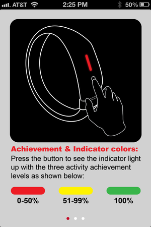 The indicator lights on the Boost.
The single button on the Boost controls all its functions: If you press the button once, the Boost will display a color to indicate your progress on your fitness goals. Red is 0 to 49 percent of your goal, yellow is 51 to 99 percent, and green is 100 percent. Holding the button for 3 seconds displays a purple indicator light and starts (or stops) the sleep mode, while holding it for 5 seconds makes the light flash blue and syncs the Boost to your phone over Bluetooth.
Operating the Boost was fairly simple, although it did take a few tries before I was able to get it to enter, or exit, sleep mode. The soft silicone made the Boost quite comfortable to sleep in, on the nights I remembered to keep it on. It did, however, prove to be a complete pain in the ass whenever I put on a sweater, sweatshirt, or jacket—the Boost’s raised profile almost always got caught in the sleeves of whatever I was wearing.
Because the Boost only displays colors to indicate your activity levels, checking it throughout the day only gives you the foggiest of ideas of where you actually are at with your goals. For example, the majority of my day the Boost displayed red, indicating that I had reached less than 50 percent of my 10,000 step goal—but I had no way to tell if I was at 4,990 steps or 200. While there are plenty of competing activity trackers that also follow this model (most notably the Jawbone UP[3] ), most of them compensate by including a detailed and attractive app. Which brings us to…
The software
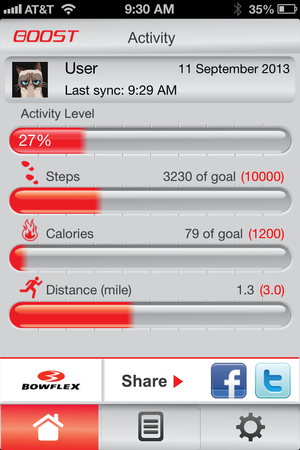 The activity screen shows your fitness progress.
Much like the hardware, the software side of the Bowflex Boost is also painfully simple. When you first open the app, it guides you through a few tutorial screens before letting you set up your user profile with information on your date of birth, height, weight, and gender. You’re then taken to the main Activity screen, which displays your profile picture, date and time of last sync, battery life, and graphs that shows your most recent activity level, number of steps, calories burned, and distance walked/run. Turning your phone into landscape (or horizontal) mode in this screen changes the view to a graph that displays your activity.
Swiping right from the Activity screen takes you to your Sleep Activity screen, which displays the time you spent in bed, the minutes you spent actually asleep, and the time (in minutes) that it took you to fall asleep. Turning the phone to landscape mode here again displays the same sleep data in graph form.
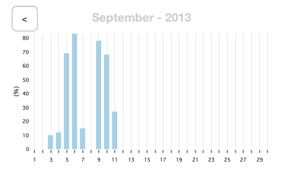 Turning the app to horizontal mode displays graphs of activity.
At the bottom of the app is a banner with linked buttons, and a row of tabs. Of the three linked buttons at the bottom, two are for sharing (to Facebook and Twitter), while the third takes you to the web page for the Bowflex Boost, which…you already clearly have, as you’re operating the app. What is the purpose of this link? Beats me.
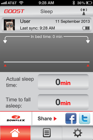 The Sleep Activity Screen
The row of tabs helps you navigate from the home or Activity screen to the Charts screen, which displays data on your Activity Level or Actual Sleep Time in either daily, weekly, monthly, or yearly views. And yes, turning to landscape mode here takes the app to the graph view for that data. The third tab is for the Settings screen which lets you adjust your target goals for steps, calories, and distance, and set your wake up time for weekdays and weekends. There are also buttons here to unpair the bracelet, and to access "support" (which consists of the three tutorial screens you see when the app begins).
I’m not quite sure how an app manages to be functional without bringing any fun into the equation (hey-yo!) but the Boost app’s simplicity makes it…boring. Sure, it’s easy to use, and offers up the bare minimum of data, but the user interface is duller than statistics homework. Aside from looking at graphs, or posting to Facebook and Twitter, there’s not much that you can do with it. Compare that to the LifeTrak Move C300[4] , which is paired with the lovely Argus app, and the Boost is at a distinct disadvantage.
Bottom line
After two weeks of using the Boost, I was pretty much over it. Pressing the button throughout the day to see red, or even red-turning-yellow, didn’t motivate me as much as seeing a step count did. Additionally, I missed functionalities that other fitness trackers provided—like the ability to track calories (which Nautlius says is forthcoming via a partnership with MyFitnessPal), heart rate, or workouts. With no accelerometer, the Boost can’t tell if I’m walking or walking up stairs, nor does it make any distinction between “running” as an activity versus walking or cycling or swimming or spin class or yoga.
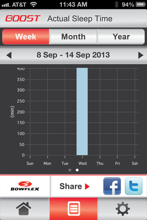 The sleep graph displays how many minutes I was actually asleep, but not the time it took me to fall asleep or how often I tossed and turned.
I was also disappointed that the sleep graphs in the app didn’t hold any of the data about how long it took me to fall asleep, only on the actual minutes spent asleep. The Boost measures the time it takes you to fall asleep and how restful your sleep was (by indicating how much you toss and turn), but I never saw any of that data within the app. Why measure something with the Boost only to forget about it in the app?
The iOS-only app is another disappointment, although Nautilus says an Android version is expected by the end of the year. And while the app allows you to change your goals daily, those goals aren’t saved or displayed within the app so you’ll need to find another way to recall if your weekend results were for a goal of 5,000 or 10,000 steps when you look at the graphs later.
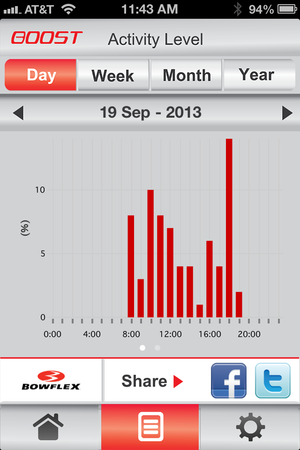 Note: The left axis for the daily activity level goes to about 15 percent, which changes the value of the data it's displaying.
Another qualm about the app: The information that is displayed in the Activity Level graph doesn’t display the full measurements—that is, for the daily view of activity, the axis in the graph goes up to 15 percent. For the week, it shows up to 40 percent, for the month 80 percent. Why do none of these graphs display a full 100 percent? What is the point of making 15 percent look like 100 percent? It may be accurately recording the data, but it’s not accurately displaying it—and with no web dashboard, there’s no other option to view the data.
Is the Boost awful? No. Is it dysfunctional, buggy, problematic? Nope. But it’s a half-measure, a stopgap, an underachiever. In a world full of Fitbits, Jawbones, FuelBands, Fitbugs, and a growing plethora of “smart” trackers and watches, the Boost needs to do better. Or at least offer a better companion app.
References
- ^ Bowflex Boost (www.bowflexboost.com)
- ^ memetastic expression (knowyourmeme.com)
- ^ Jawbone UP (www.techhive.com)
- ^ LifeTrak Move C300 (www.techhive.com)
No comments :
Post a Comment